8 January 2020
By Abi Cox and Tom Morton
Your first impression of an organisation like Change Grow Live can be the difference between you getting help or not.
Our old brand and website didn't reflect the kind of charity we are. They didn't reflect the kindness, passion and enthusiasm of our staff and volunteers across the country. The moment someone walks into one of our services or visits our website, they should know straight away that our priority is to help them to change their life.
So we decided to do a ‘brand refresh’ and create a new website that would focus on helping people who use our services or want support. We launched our new identity along with our new website in November 2019.
It’s been rewarding and challenging in equal parts, and we’ve created something we feel genuinely proud of. We’ve learned a huge amount along the way. Whether you’re a growing social enterprise or a large not-for-profit, we hope that some of the lessons we’ve learned might help you make a difference in people’s lives too.
Skip to:
What we learned along the way
1. You are not the user
We took a user-centred design approach for the project. This was a new concept to some of us in the marketing team, but it made sense – we’ll focus the site around the needs of our users. But who are our users, and what do they need?
We used the four-stage 'Double Diamond' method to get a deep understanding of our users and make sure we built the site around their needs – not ours. The stages are: discover, define, develop, deliver. Digital projects often fail because we jump straight into designing. But how do we know what our users need, and therefore what to design? We skip the critical first two steps.
We knew that the ‘discover’ phase was going to be really important if we were going to deliver something of genuine value. We needed to go and speak to people first-hand and find out what they needed from our site and our communication - we needed to do extensive user experience (UX) research.
If you'd like to learn more about the Double Diamond method, take a look at this page from the Design Council.
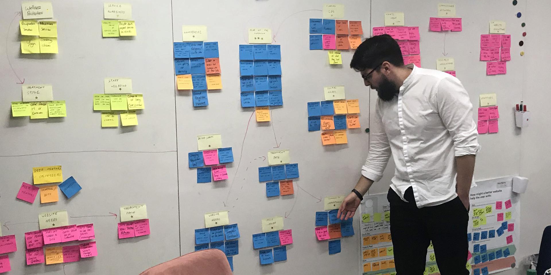
We carried out extensive user experience research to understand our users and their needs.
2. Sign up to a manifesto
As a project team we were passionate about this new approach, but we knew we wouldn’t get anywhere unless we convinced senior people within the organisation to come along with us. So, we created a Project Manifesto that laid out key principles we’d stick to all the way through. They included the following:
- We will focus on user needs
- People who use our services will be our primary audience (but we’ll make sure all our other audiences can complete their key tasks too)
- The site will be accessible
- We’ll test the site with users to make sure they can use it
- We will take a continuous improvement approach
Your manifesto is a set of rules you’re going to stick to. They might seem obvious at the start, but if your project is going to run for 12 months (or longer), it’s easy to drift or lose focus. A manifesto kept our team and our senior stakeholders on the same path from the outset, helping us respond to feedback and keep moving forward.
3. Listen most to the things that are hard to hear
Our research told us we came across as boastful and overly focused on efficiency. It's not who we are, and it was hard to hear. Sometimes it’s tempting to ignore feedback we don’t want to hear. But we were determined to address it.
As we mentioned earlier, we decided to change the way Change Grow Live looks and sounds. We:
- Created a new Tone of Voice
- Defined a new set of values
- Created a new guiding principle – believe in people
- Updated our brand identity including our logo
- Created a brand colour hierarchy, introducing primary colours that meet WCAG standards for text colour contrast levels - improving the user experience for people with visual impairments
- Changed our brand font to Gotham, a sans serif font that’s clearer and easier to read than Lexia - our old slab serif font
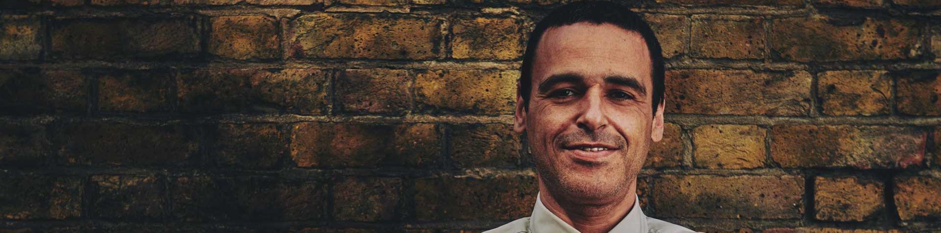
We organised a photoshoot with people who use our services, our volunteers and staff, and we asked them to tell us their stories. We hope that the new photos are much warmer, more human, and reflective of who we really are – kind, compassionate people who want to change society for the better, however we can.
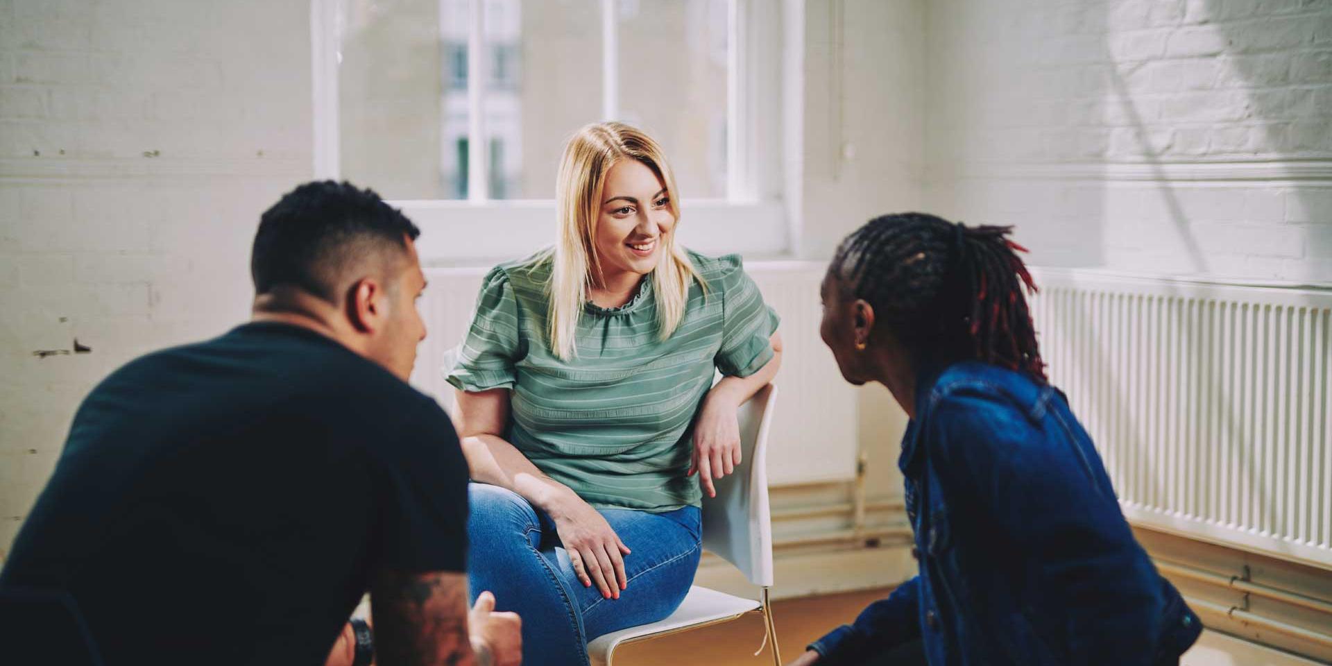
Here is one of the photos from our photoshoot with staff, volunteers and people who use our services.
4. Spot the opportunities
Throughout the project we used external expertise to teach us new methods and challenge our assumptions. We worked with Spotless, a service design agency, on the user experience research for this project. We were prepared for some hard truths, one of which came quickly as we realised that many of the people using our services didn’t know much about our charity, and they’d never used our website – some didn’t even know we had one.
We also uncovered some big opportunities. When people go to one of our services for the first time, there are a huge number of misconceptions and they often feel totally in the dark about what to expect. This ‘fear of the unknown’ was contributing to a feeling of stress and anxiety for people. We had an opportunity with the website to reduce that anxiety and make sure people know what will happen when they walk through that door for the first time, and what their experience might look like after that too.
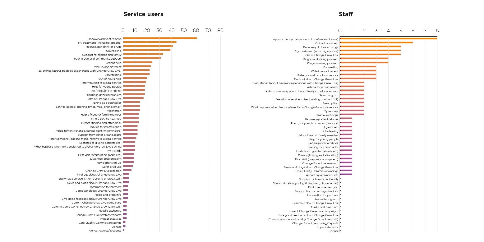
5. Find your users’ top tasks
To find out what people wanted from the site, we used a technique called Top Tasks, with the help of User Experience Consultant Danny Hope.
We put together a list of potential tasks that people might want to do, and refined that list down to 50. Then, we asked people to pick their top 5.
There were some clear leaders (as we've shown in the graphs below). Once we had enough submissions, we made a list of the ten most popular ‘top tasks’. We used this list to define our site structure, content priorities, design and testing.
6. Design for flexibility
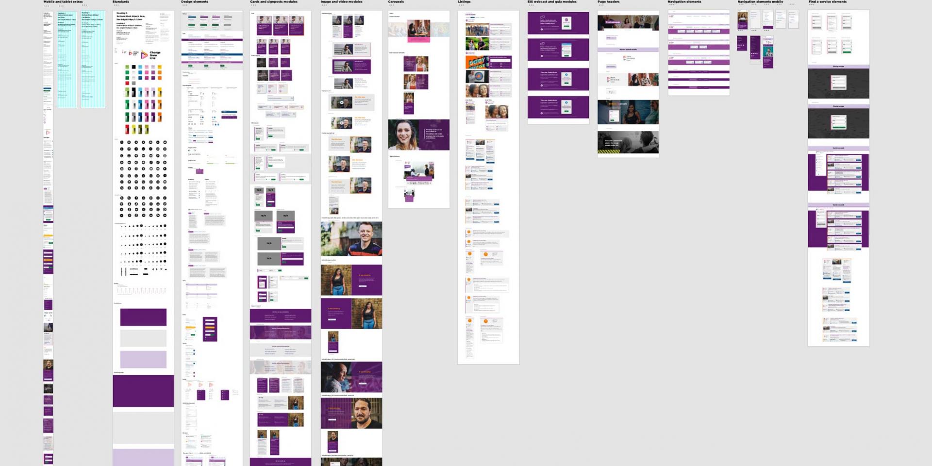
An important aspect of our approach was making a site that we could keep improving after launch. This meant giving ourselves the flexibility to make changes quickly in response to feedback.
So we invested in creating a design system, starting with a pattern library. This pattern library consists of various different design elements, which could then be combined to make up a page. That page will be part of a user flow, helping users get to the content they need quickly and easily, and complete their tasks. We took inspiration from other organisations who have pioneered the use of Design Systems, like Barnardo’s.
7. Content is key
We worked with Lauren Pope, a content strategist, to create a strategy for all the site content, followed by a content model, message hierarchy and content plan.
We also came up with a new process for getting our content approved and signed off. We listed all the key themes for content on the site, and for each one we identified a subject matter expert and someone who could give final approval. There was just one signatory for each theme, except for medical content where we had three. This really helped us to work quickly while also making sure the pages were high quality.
Like any project, we made mistakes and there are things we would do differently next time. Because we started the content late into the project, we were designing components and pages without knowing what content would be in there, which made things challenging. We also struggled to gather all the content we needed for our local service sites in time for launch. We learned the importance of bringing the right colleagues along with the project early – not just our exec team.
We wanted to make our content as clear, calm and helpful as possible.
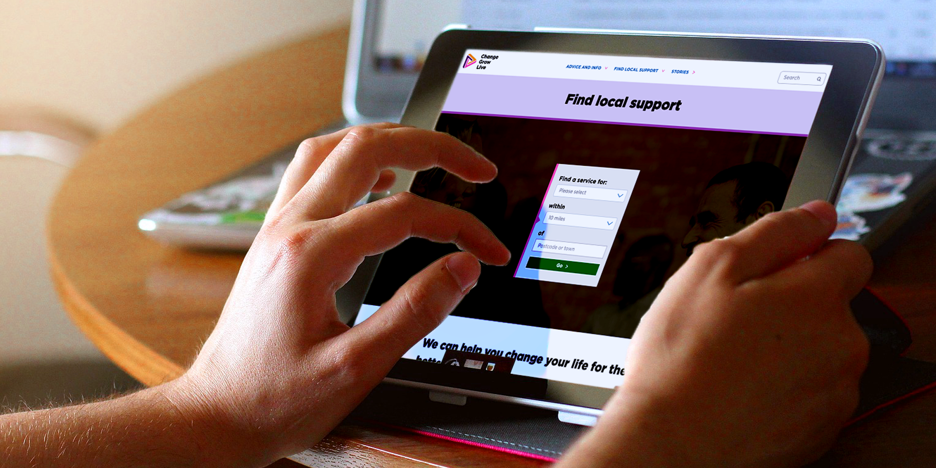
8. Cut the clutter
We knew the site needed to get people help as simply and easily as possible, without any distractions. One of the new features we created was our ‘get help’ form, which you can see here. The split-button design allows users to tell us what they need and who they are, then go straight to the advice or information they need. We also reduced clutter on the main menu, focusing on the priority advice and info topics that we identified during the discovery phase.
9. Don’t assume what you’ve done is right
We’ve made a shiny new site, brilliant! Job done.
Not quite. We need to know if it works! To find out, we completed four days of task-based user testing and BERT testing (emotional response testing). We have lots more planned too. We’ll keep testing the site with users to see what's working and what needs improving. Thanks to our pattern library, we will be able to make quick changes and test them to see if they are improving the user experience. And if users can’t complete the tasks they need to do on the site, we won’t be precious about that, we’ll change it and test again.
Some of the feedback from our testing:

10. A product is never finished
The first version of our new site is live, but this is only the start. We’re going to keep learning, keep refining and keep building on what we’ve got. We will take one theme at a time, discover, define, develop, test – and be prepared to be wrong. We’ll ask our users to keep challenging us.
Learning from you
We’d love to hear what you thought of this article – did you find anything useful? Is there something you wish we’d talked about?
If you have any feedback or questions about the project or the website itself, please get in touch via Twitter or our contact us form – choose ‘speak to the marketing team’ from the options.
Tools we used during the project
Project management, communication and testing
- Trello
- Miro
- Notion
- Microsoft Office 365
- Microsoft Teams
Content
- GatherContent
- Hemingway
Design
- Adobe XD
- Adobe Photoshop
- Adobe Illustrator
- Adobe InDesign
User testing
- Loom
- UsabilityHub
- Rocket Surgery Made Easy: The Do-it-yourself Guide to Finding and Fixing Usability Problems - Steve Krug
- Treejack by Optimal Workshop